-Jun-05-2026-05-45-31-0914-AM.png)
Business intelligence tools help teams unify data and make decisions on consistent metrics. The top BI platforms in 2026 are Power BI, Tableau, Qlik Sense, Looker, Sisense, ThoughtSpot, Domo, Zoho Analytics, Google Looker Studio, and Metabase, compared below on pricing, AI features, and enterprise fit. OvalEdge sits one layer beneath these tools, governing and cataloging your data so BI dashboards stay accurate and trusted.
If you are evaluating BI tools right now, you are probably staring at a shortlist of 10 platforms that all sound roughly the same. AI insights. Self-service dashboards. Real-time analytics. The pitch decks blur together fast.
The differences show up later. In pricing tiers that creep upward, AI features that work well on some data and badly on others, and governance gaps that turn dashboards into a guessing game.
The upside of choosing well is significant.
91% of BI users report better decision-making once the right platform is in place, as per the 2025 ResearchGate report.
This guide compares the top 10 BI tools in 2026 on what actually matters: pricing, AI capability, enterprise fit, and how they hold up at scale.
You will also get a five-step framework for choosing the right one. And because BI is only as trustworthy as the data feeding it, we will show where OvalEdge sits underneath the dashboard layer.
Top 10 BI tools compared at a glance
|
Tool |
Best for |
Standout strength |
Pricing |
Watch-out |
|
Microsoft Power BI |
Microsoft-stack teams |
Price-to-performance, Copilot AI |
Pro $14/user/mo; PPU $24/user/mo; Fabric capacity from ~$5,000/mo |
Tiering gets complex |
|
Tableau |
Visual analytics and storytelling |
Best-in-class visualization |
Standard: Viewer $15, Explorer $42, Creator $75/user/mo (annual) |
The enterprise tier roughly doubles each rate |
|
Qlik Sense |
Deep, free-form exploration |
Associative analytics engine |
Qlik Sense Business from $30/user/mo (annual); Enterprise quote-based |
Steeper learning curve; capacity-based at enterprise scale |
|
Looker |
Governed metrics on cloud warehouses |
LookML semantic layer |
Quote-based; |
Requires LookML; no public pricing |
|
Sisense |
Embedded analytics in products |
Developer-friendly embedding |
Launch from $399/mo; mid-market deployments $25K–$150K+/year |
Set up effort for custom builds |
|
ThoughtSpot |
Natural-language, AI search analytics |
Spotter AI agent |
Essentials $25/user/mo; Pro $50/user/mo (annual); Enterprise custom |
AI query caps on lower tiers |
|
Domo |
Cloud-first executive dashboards |
All-in-one cloud platform |
Credit-based model; costs can climb with usage |
|
|
Zoho Analytics |
SMBs and budget teams |
Low cost, broad connectors |
Performance dips above 10M rows |
|
|
Google Looker Studio |
Free Google ecosystem reporting |
Free, native Google integration |
Limited governance and scale |
|
|
Metabase |
Open-source self-service |
Free to deploy, SQL-friendly |
Open Source free; Cloud Starter $100/mo + $6/user; Pro $575/mo + $12/user |
Governance features locked to Pro and Enterprise |
All pricing verified against vendor pricing pages and independent procurement data (Vendr, Coefficient, Mammoth) as of April 2026. Vendor pricing changes frequently. Confirm current figures on each vendor's pricing page before publishing.
Top 10 business intelligence tools in 2026 (Compared)
Choosing the right business intelligence tool depends on how well it fits the data ecosystem, supports decision-making workflows, and scales with growing data complexity. Below are the 10 BI tools organizations most commonly evaluate in 2026, grouped by where each one fits best, from enterprise reporting to embedded analytics and self-service.
.jpg?width=1024&height=569&name=Top%2010%20business%20intelligence%20tools%20in%202026%20(Compared).jpg)
1. Microsoft Power BI
Microsoft Power BI is a widely used business intelligence platform that helps teams visualize data, track performance, and share insights. It integrates tightly with Azure, Excel, Microsoft 365, and Dynamics, which makes it the default choice for Microsoft-stack organizations. Power BI supports both self-service analytics for business users and enterprise-scale reporting for larger deployments.
Key features
-
Interactive dashboards with drill-downs, filters, and real-time updates for KPI tracking
-
Hundreds of native connectors for cloud services, databases, files, and on-prem systems
-
Power Query for low-code data cleaning, modeling, and transformation
-
Copilot and AI-assisted analytics, including anomaly detection and natural language querying
Pros
-
Tight integration with the Microsoft ecosystem
-
Strong balance of self-service and enterprise reporting
-
Large user community and frequent updates
Cons
-
Licensing tiers can be hard to navigate
-
Advanced features often require Premium or Fabric capacity
2. Tableau
Tableau is a data visualization and business intelligence platform known for helping users explore data visually and turn it into interactive dashboards. Analytics teams and business users pick it when visual analysis, data storytelling, and exploratory analytics matter more than cost.
It is commonly used by organizations working with large datasets and cloud data warehouses that need flexible reporting for decision-making and presentations.
Key features
-
Drag-and-drop interface for highly interactive dashboards with filters and drill-downs
-
Visual exploration and data storytelling tools for guiding stakeholders through insights
-
Broad connectivity to cloud warehouses, relational databases, files, and SaaS platforms
-
Tableau Prep for cleaning and combining data before analysis
Pros
-
Industry-leading visualization capabilities
-
Strong support for visual exploration and storytelling
-
Intuitive interface for business users
Cons
-
Expensive at enterprise scale
-
Data modeling and governance need additional setup
3. Qlik Sense
Qlik Sense is a self-service analytics platform built around an associative engine that lets users explore data freely without predefined queries or rigid hierarchies. That approach makes it well-suited for complex analysis where the goal is to uncover hidden relationships in data.
It is commonly used by organizations that need flexible data discovery, hybrid cloud deployments, and analytics that go beyond standard dashboarding.
Key features
-
Associative engine surfaces all possible data relationships, including unselected values
-
Drag-and-drop dashboard creation supporting ad hoc and guided analytics
-
In-memory processing for fast queries on large, complex datasets
-
Data Load Editor for scripted transformations and advanced data modeling
Pros
-
Powerful associative analytics for deep exploration
-
Strong in-memory performance
-
Cloud, on-prem, and hybrid deployment options
Cons
-
Steeper learning curve for non-technical users
-
Needs governance planning to avoid metric inconsistency
4. Looker
Looker is a business intelligence platform built around LookML, a centralized semantic modeling layer that defines metrics once and reuses them across dashboards. Not to be confused with Looker Studio, which is a separate, much cheaper Google product for lightweight dashboarding.
Rather than leading with visualization, Looker emphasizes consistent definitions, governed access, and analytics that run directly on cloud data warehouses. It suits organizations with strong data engineering teams that want metric consistency across departments or that need to embed analytics into internal tools and products.
Key features
-
LookML semantic layer for reusable, governed metric definitions
-
Cloud-native architecture that runs directly on BigQuery, Snowflake, or Redshift
-
Centralized governance and role-based access controls
-
Embedded analytics and APIs for product and internal tool integration
Pros
-
Strong metric consistency through centralized modeling
-
Native fit for cloud data warehouse environments
-
Built-in governance capabilities
Cons
-
LookML knowledge is required, which slows adoption
-
Less intuitive for casual or non-technical users
5. Sisense
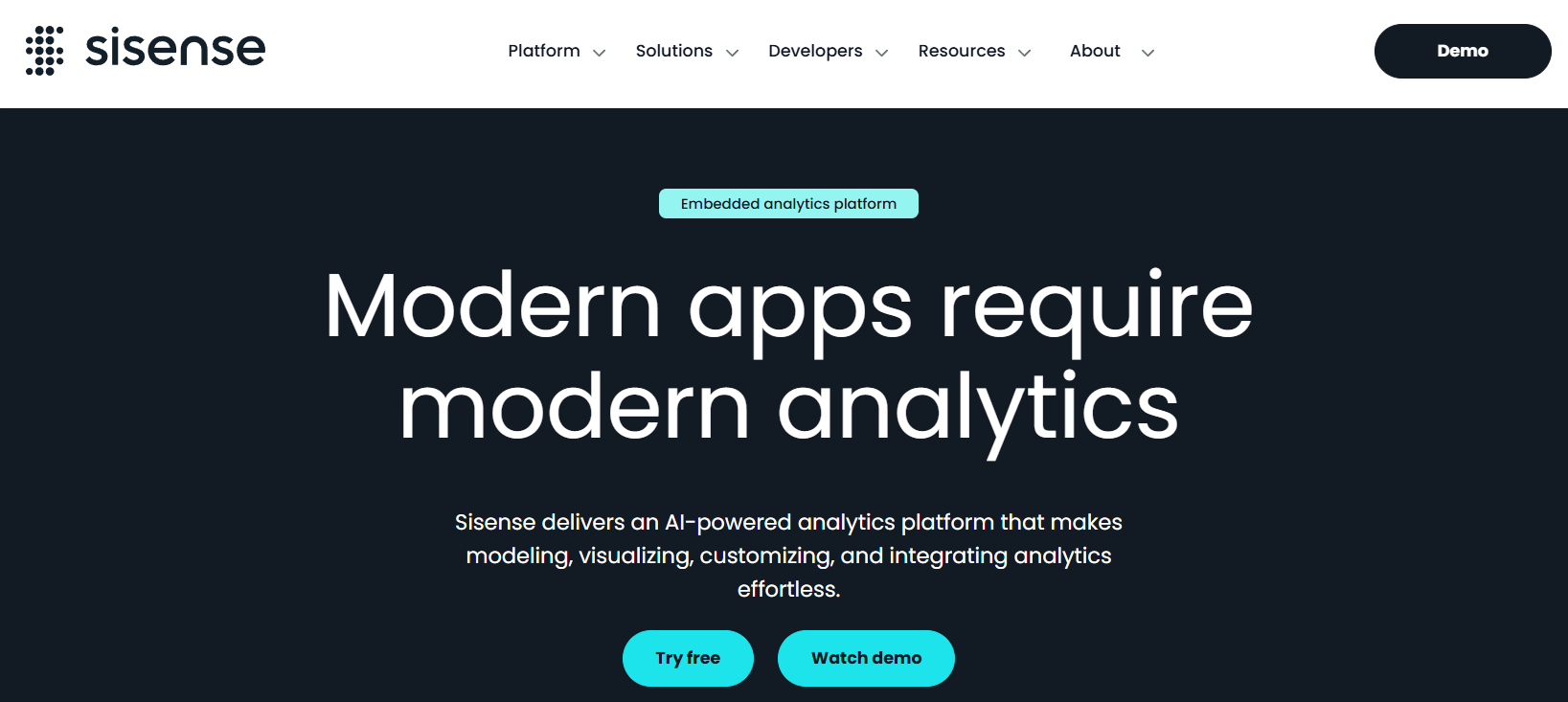
Sisense is a business intelligence platform built primarily for embedding analytics into applications and products. SaaS companies and product teams pick it when the goal is delivering analytics directly to end users rather than only to internal dashboards.
Sisense combines traditional BI capabilities with a developer-first focus, making it suitable for highly customized and scalable analytics experiences inside products.
Key features
-
Embedded analytics for placing dashboards inside web and SaaS applications
-
Extensive APIs and customization options for product-specific analytics
-
Flexible data modeling and pipelines for diverse, high-volume sources
-
AI-assisted analytics with natural language querying and automated insights
Pros
-
Strong embedded analytics capabilities
-
Highly customizable for product and engineering teams
-
Scales well for large datasets and concurrent users
Cons
-
Implementation is complex for non-technical teams
-
Higher setup effort for deeply customized use cases
6. ThoughtSpot
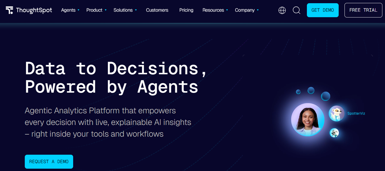
ThoughtSpot is an AI-native business intelligence platform built around natural-language search. Business users type a plain-English question and get a chart back without writing SQL or building a dashboard from scratch. Spotter, the platform's AI agent, handles follow-ups and surfaces related insights. ThoughtSpot suits teams that want non-technical users to query data on their own without going through an analyst queue, especially on top of cloud warehouses like Snowflake, BigQuery, and Databricks.
Key features
-
Natural-language search that converts questions to SQL automatically
-
Spotter AI agent for conversational analytics and follow-up queries
-
SpotIQ for automated insight discovery and anomaly detection
-
Native connectivity to Snowflake, BigQuery, Databricks, Redshift, and Azure Synapse
Pros
-
Strongest natural-language and AI search experience available
-
Removes SQL dependency for business users
-
Scales well on cloud data warehouses
Cons
-
Visualization customization trails Tableau
-
Spotter AI query caps on lower tiers can constrain heavy users
7. Domo
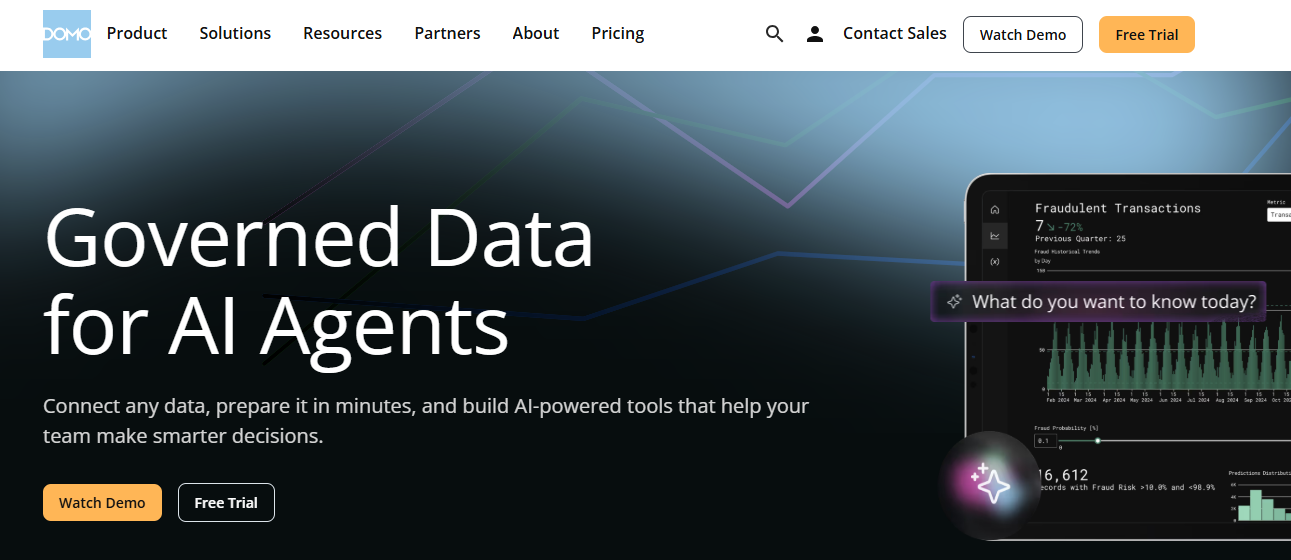
Domo is a cloud-first business intelligence platform built around executive dashboards, mobile reporting, and an all-in-one approach that bundles data integration, ETL, visualization, and AI agents into one managed service. Mid-market and enterprise teams pick it when the goal is a fully hosted BI environment without building a separate data stack. Executives who actually use BI on their phones tend to rate it highly for mobile.
Key features
-
All-in-one platform covering ingestion, ETL, visualization, and collaboration
-
Strong mobile experience for executive dashboard consumption
-
1,000+ pre-built connectors for cloud and SaaS data sources
-
Built-in AI agents and Magic ETL for low-code data preparation
Pros
-
Genuinely strong mobile and executive reporting experience
-
Unified platform reduces the need for separate ETL or warehouse tools
-
Fast time to first dashboard once data is connected
Cons
-
Credit-based pricing makes costs unpredictable at scale
-
Out of reach for small teams, given the contract floor
8. Zoho Analytics
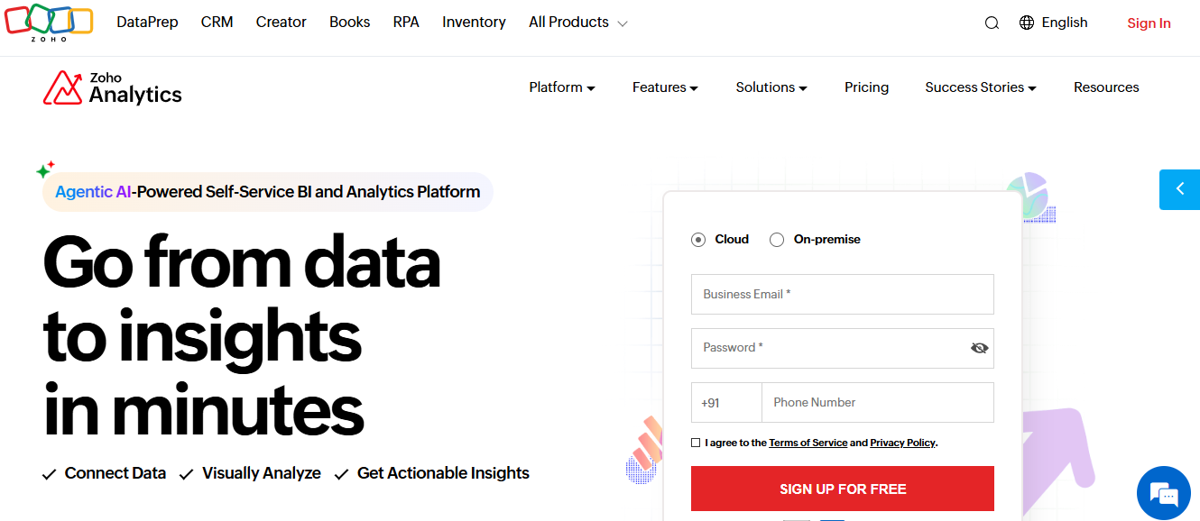
Zoho Analytics is a self-service business intelligence and reporting platform built for small and mid-sized businesses, especially teams already using other Zoho products. It covers dashboard creation, data prep, and AI-assisted analytics at a price point well below the enterprise BI tier.
Hence, it's one of the few credible options for budget-conscious teams that need real reporting capabilities beyond spreadsheets.
Key features
-
250+ data connectors covering SaaS, databases, cloud storage, and Zoho's own apps
-
Zia, an AI-powered assistant for natural-language queries and forecasting
-
Drag-and-drop dashboard builder with self-service report creation
-
Native integration across Zoho CRM, Books, Desk, and the Zoho One bundle
Pros
-
Strong value at the SMB price point
-
Tight integration with the Zoho ecosystem
-
Free tier covers very small teams or pilots
Cons
-
Performance dips above 10 million rows on Enterprise
-
Visualization depth trails Tableau and Power BI
9. Google Looker Studio

Google Looker Studio (formerly Google Data Studio) is technically a free dashboarding and reporting tool rather than a full BI platform, but it earns a spot on most BI shortlists because of how widely teams use it. It pulls data from Google Analytics, Google Ads, BigQuery, Google Sheets, and 800+ community connectors, then builds shareable dashboards in minutes.
The Pro tier adds team workspaces and Google Cloud support. Looker Studio is a separate product from Google's enterprise Looker platform and serves a different buyer.
Key features
-
Free unlimited dashboards and reports for individual and team use
-
Native connectors for Google Analytics, Ads, Sheets, BigQuery, and Search Console
-
800+ community connectors for non-Google data sources
-
Real-time collaboration and shareable report links by default
Pros
-
No-cost entry point for full dashboarding
-
Tight, native integration with Google Workspace and Google Cloud
-
Easy to set up; non-technical teams can publish in hours
Cons
-
Limited governance and data modeling compared to enterprise BI
-
Performance ceiling on large or non-Google datasets
10. Metabase
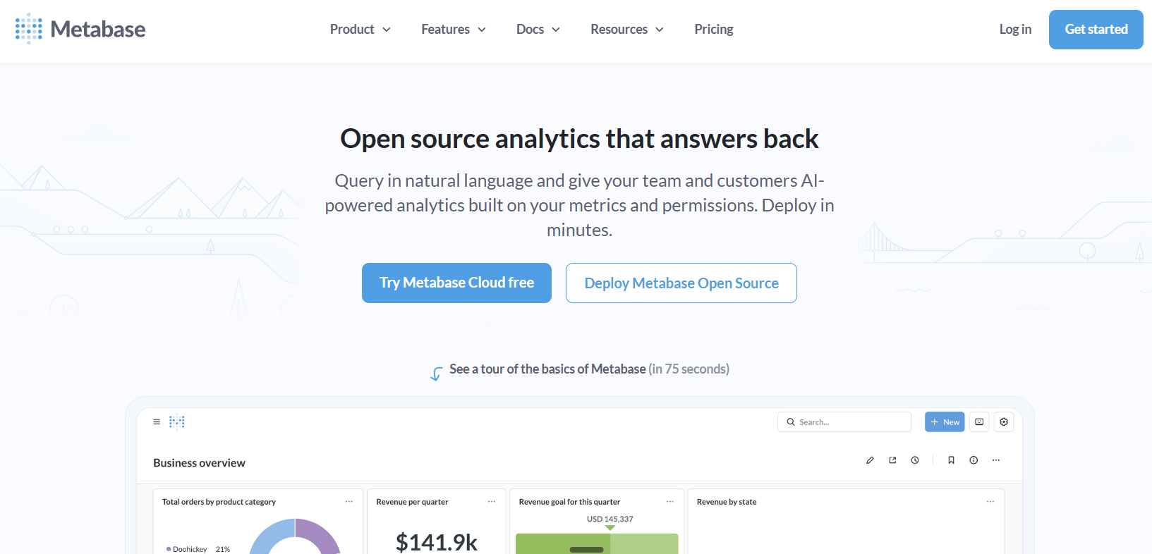
Metabase is an open-source business intelligence tool built around fast, SQL-friendly self-service. Engineering-led teams pick it because it's free to deploy, easy to run, and gives non-technical users a query builder they can actually use without writing SQL. The managed Cloud tiers add hosting, governance, and embedding for teams that don't want to maintain their own infrastructure.
Key features
-
Open-source core, free to self-host with full functionality
-
Query builder lets non-technical users build reports without SQL
-
Native SQL editor with autocomplete and saved snippets for analysts
-
Embedded analytics support on Pro and Enterprise tiers
Pros
-
Genuinely free entry point with no functional limits on the open-source edition
-
Fast to deploy and easy for engineering teams to maintain
-
Clean, modern interface that non-technical teams adopt quickly
Cons
-
Governance features (row-level permissions, SSO) locked to Pro and Enterprise
-
Self-hosting still needs DevOps effort and infrastructure costs
The right tool depends less on the feature list and more on how well it fits the data, team, and decisions it has to support. Here's a five-step framework for working through that decision without getting lost in vendor demos.
How to choose the right bi tool for your organization
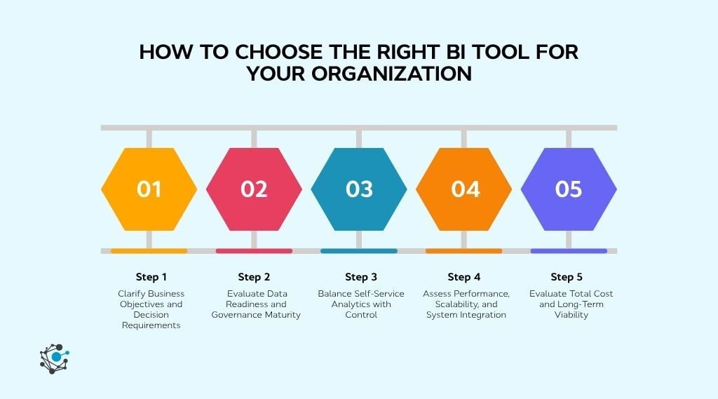
A structured evaluation approach helps avoid picking a BI tool based only on features. These five steps focus on aligning analytics capabilities with business goals, data maturity, and long-term scalability.
Step 1: Clarify business objectives and decision requirements
A BI tool should support the decisions an organization actually makes, not just generate reports. Without clear objectives, dashboards get built and ignored.
Where to start
-
Document the specific decisions each team needs to make using BI, such as budget allocation, pipeline forecasting, or operational planning.
-
Map these decisions to the KPIs and metrics that must be tracked consistently.
-
Rank use cases by business impact to guide tool prioritization and scope.
Step 2: Evaluate data readiness and governance maturity
Even the most powerful BI tools struggle when data is fragmented, poorly defined, or inconsistent. Governance maturity directly affects whether teams trust the dashboards built on top.
What to audit first
-
Identify where data definitions differ across teams and systems, creating reporting conflicts.
-
Review how metadata, lineage, and ownership are managed across datasets.
-
Determine whether a data intelligence platform like OvalEdge is needed to standardize and govern data before BI usage.
Step 3: Balance self-service analytics with control
BI adoption grows when users can explore data independently without sacrificing accuracy or security. The challenge is that unrestricted self-service often leads to inconsistent metrics and duplicated logic. The right tool balances flexibility with centralized control, which is the core promise of self-service BI tools.
What to test before buying
-
Test how easily business users can create or modify dashboards without IT support.
-
Evaluate how metric definitions and calculations are governed across reports.
-
Review role-based access controls to confirm sensitive data is protected.
Step 4: Assess performance, scalability, and integration
As data volume and adoption grow, BI performance becomes the silent failure point. Integration strength then decides how cleanly the tool fits into the existing stack.
What to validate at scale
-
Validate query performance and dashboard load times against production-sized datasets.
-
Confirm compatibility with cloud warehouses, data pipelines, and identity systems.
-
Assess how the tool handles refresh frequency, concurrency, and peak usage.
Step 5: Evaluate total cost and long-term viability
License fees are only the visible part of the BI cost. Long-term viability depends on how pricing, adoption, and operational effort scale together over the contract.
What to factor into the total
-
Calculate total cost based on creators, viewers, data volume, and refresh needs.
-
Factor in onboarding, training, and ongoing administration requirements.
-
Run a proof of concept to validate usability, performance, and ROI before committing.
Even the right tool fails if the data underneath it isn't ready, the access isn't controlled, or no one owns the dashboards once they're live.
How to implement a BI tool successfully
A successful BI implementation is not defined by how fast dashboards go live, but by how consistently teams trust and use them. Organizations that treat BI as a data and governance initiative, not just a reporting project, see higher adoption and better decision outcomes.
1. Assign owners for every metric and dashboard
BI projects stall when accountability is diffuse. Without a named owner for each metric, conflicting versions emerge, and no one fixes them. Ownership is the difference between a dashboard that gets maintained and one that quietly goes stale.
Who owns what
-
Assign a single owner for every business metric, dashboard, and source dataset.
-
Define who approves changes to metric definitions before dashboards are published.
-
Tie BI success measures to business outcomes like adoption rate and decision speed, not dashboard count.
2. Clean, standardize, and catalog data before connecting BI
Most BI issues originate upstream. By the time a dashboard shows wrong numbers, the problem is usually in the source data, the transformation logic, or the absence of a shared definition. Doing this work before connecting the BI tool avoids rebuilding dashboards every time the data shifts.
The pre-connection checklist
-
Identify authoritative data sources for each reporting domain (and retire the rest).
-
Standardize calculation logic and business definitions across teams before they reach the BI layer.
-
Catalog datasets with lineage and ownership context so dashboard builders know what they're working with.
3. Build access controls, audit trails, and compliance workflows
Security retrofits get expensive fast. The cheapest time to set up role-based access, audit trails, and compliance workflows is during initial implementation, when adoption is small, and the configuration is reversible. The most expensive time is after a regulator asks.
What to set up on day one
-
Configure role-based access aligned with data sensitivity, not just job title.
-
Enable audit logs and lineage tracking from the first dashboard onward.
-
Automate approval workflows for access changes to avoid manual bottlenecks at scale.
4. Launch with two or three business-critical dashboards
Phased rollout is the difference between a BI program that builds confidence and one that buries the team in tickets on day one. Starting narrow proves the tool works, gives the team a feedback loop, and creates a reference point for everything that follows.
How to phase the first 90 days
-
Pick one or two dashboards tied to a decision leadership already makes weekly or monthly.
-
Validate accuracy with the actual users before opening access broadly.
-
Iterate on the first dashboards based on user feedback before expanding to new teams.
5. Measure adoption and trust, not just logins
A dashboard with 200 logins and zero decisions made is a failed dashboard. The metric that matters is whether reports change what the team actually does. Tracking trust signals (revalidations, manual recalculations, conflicting reports) catches problems before adoption stalls.
The trust signals to watch
-
Track dashboard usage alongside feedback frequency and reported data issues.
-
Monitor how often metric definitions get questioned or recalculated outside the BI tool.
-
Use data lineage and catalog insights, including from a platform like OvalEdge, to address trust gaps before they affect adoption.
How OvalEdge strengthens BI implementations
Business intelligence tools turn data into decisions, but only when the data underneath is governed and consistent. The 10 tools above each fit a different stack, budget, and team. The chosen framework narrows the shortlist. The implementation discipline keeps the chosen tool from quietly failing after 12 months in.
What none of those steps solve on their own is the problem most BI rollouts hit eventually: dashboards that show the right answer for the wrong reason, or different answers across teams looking at the same metric. That's a data intelligence problem, not a BI tool problem.
Where OvalEdge fits in a BI stack
OvalEdge sits one layer beneath the BI tool and does four things that keep dashboards honest at scale.
Governance, lineage, and cataloging in one place. Trace any metric back to its source when two dashboards disagree, and remove the analyst-engineer ping-pong that follows.
Data quality before BI sees it. Standardize and validate data upstream so reports are built on a clean baseline, not corrected after the fact.
Cross-system visibility across the stack. Map data flows end to end across databases, warehouses, and SaaS sources, so troubleshooting takes minutes, not days.
Compliance-ready metadata. Show regulators exactly which data fed a report, who accessed it, and how it was transformed, without rebuilding the history manually.
If inconsistent definitions, low adoption, or dashboards nobody trusts are slowing things down, OvalEdge governs, catalogs, and documents that data before it reaches BI, so every report holds up.

See OvalEdge in action and turn your BI tool into a source of decisions people trust.
FAQs
1. What is the difference between a BI tool and a data intelligence platform?
BI tools focus on visualizing and reporting data. Data intelligence platforms manage the context behind it, including governance, lineage, and quality, so BI dashboards use trusted data.
2. Can multiple BI tools coexist in the same organization?
Yes. Many enterprises use Power BI for finance, Tableau for marketing, and Looker for product analytics on the same data. A data intelligence platform like OvalEdge keeps definitions, lineage, and access consistent across them, so reports don't conflict across teams.
3. Which BI tool is best for small businesses?
Zoho Analytics, Microsoft Power BI, and Metabase offer the best balance of cost and capability for small and mid-sized teams. Zoho Analytics covers broad connectors on a budget, Power BI suits Microsoft-based teams, and Metabase is a free open-source option for engineering-led teams.
4. How much do business intelligence tools cost?
Pricing ranges from free to enterprise quote-based. Free tiers exist for Metabase, Looker Studio, and Zoho Analytics. Enterprise platforms like Looker and Sisense require quotes.
5. Power BI vs Tableau: Which one should a team pick?
Pick Power BI for Microsoft-stack teams that need strong price-to-performance and built-in AI. Pick Tableau when visualization quality and visual storytelling are the priority, and budget is less of a constraint. Both are enterprise-grade. Ecosystem fit and cost usually decide.
6. Do BI tools work without good data governance?
They run, but they rarely earn trust. When definitions differ across teams or sources aren't governed, dashboards produce conflicting numbers and adoption drops. A data intelligence platform like OvalEdge governs and documents data before it reaches BI, so reports stay consistent.
Deep-dive whitepapers on modern data governance and agentic analytics
OvalEdge Recognized as a Leader in Data Governance Solutions

.png?width=1081&height=173&name=Forrester%201%20(1).png)
“Reference customers have repeatedly mentioned the great customer service they receive along with the support for their custom requirements, facilitating time to value. OvalEdge fits well with organizations prioritizing business user empowerment within their data governance strategy.”
.png?width=1081&height=241&name=KC%20-%20Logo%201%20(1).png)
“Reference customers have repeatedly mentioned the great customer service they receive along with the support for their custom requirements, facilitating time to value. OvalEdge fits well with organizations prioritizing business user empowerment within their data governance strategy.”
Gartner, Magic Quadrant for Data and Analytics Governance Platforms, January 2025
Gartner does not endorse any vendor, product or service depicted in its research publications, and does not advise technology users to select only those vendors with the highest ratings or other designation. Gartner research publications consist of the opinions of Gartner’s research organization and should not be construed as statements of fact. Gartner disclaims all warranties, expressed or implied, with respect to this research, including any warranties of merchantability or fitness for a particular purpose.
GARTNER and MAGIC QUADRANT are registered trademarks of Gartner, Inc. and/or its affiliates in the U.S. and internationally and are used herein with permission. All rights reserved.